
AI Is Not the Designer, You Are! Better Prompts Create Better Flyers
AI Is Not the Designer, You Are
How Better Prompts Create Better Flyers
Artificial intelligence has become one of the most useful tools available to small businesses, event organizers, nonprofits, clubs, and community groups. In just a few minutes, it can help create graphics, write captions, and produce marketing material that once took far more time, skill, or money to complete. For many people, especially those working with tight budgets, AI has made it possible to create visual content that would have been difficult to afford only a few years ago.
At the same time, AI has also developed a reputation for producing flyers that look busy, confusing, or overly complicated. Spend a little time online and it is easy to find event flyers packed with random objects, excessive effects, unreadable text, or so much information that the viewer does not know where to look first. It is tempting to blame the software itself, but in most cases the real issue is not the technology. The issue is the prompt.
Most people new to AI make the same mistake. They open a program and type something simple like, “Make me a flyer for my event.” The software responds quickly, but because very little direction was given, the result is often generic, cluttered, and difficult to read. AI is not a mind reader. It can only work with the information it is given. That is why the quality of the result depends so heavily on the quality of the instructions.
A good way to think about AI is to compare it to a tool like a cordless drill. You would not take a drill out of the box, throw it at a pile of screws, and expect a bookshelf to appear. You would learn how to use it, make a few mistakes, and get better with practice. AI works the same way. The more clearly you explain what you want, the better the result becomes.
That is why one simple idea matters throughout this article: AI is not the designer, you are. Every choice still begins with you. The colors, the layout, the message, the visual style, and the overall tone all come from your direction. AI is only the tool helping bring that idea to life.
Good design principles have not changed just because AI exists. Whether someone is using Canva, Photoshop, Adobe Express, or an AI image generator, a strong flyer still needs the same basic things. It should quickly tell the viewer what the event is, when it is happening, where it is taking place, why they should attend, and how much it costs. If those answers are not easy to find within a few seconds, the flyer is not doing its job.
One of the biggest mistakes people make is thinking that more information automatically makes a flyer better. In reality, the opposite is usually true. Experienced designers often spend more time removing unnecessary elements than adding new ones. White space is not wasted space. It gives the eye room to rest and allows the most important details to stand out. A clean flyer almost always looks more professional than one filled with extra graphics, decorative clutter, and too much text.
The good news is that someone does not need to be a professional designer to make a better flyer. They simply need to give AI better instructions. A prompt is like a blueprint. The more clear, organized, and specific the blueprint is, the better the final result will be. The following copy and paste prompt is designed to help beginners create cleaner, more readable, more professional event flyers by focusing on clarity instead of clutter.
Copy and Paste Flyer Prompt ⬇️
Act as an experienced graphic designer with over 20 years of experience creating professional event flyers.
Create a flyer that is 1080 x 1350 pixels (3:4).
Use a clean, modern Canva style layout with flat design elements.
Use my brand colors:
Add your colors here.Use these fonts:
Add your preferred fonts here.Use only one main image or illustration as the focal point. Do not add unnecessary decorations or unrelated objects.
Use no more than two fonts. Create a clear visual hierarchy so the most important information stands out first.
Leave plenty of white space. Do not fill every empty area with graphics or text.
Make the flyer easy to read from six feet away. Use high contrast between text and the background. Do not place text over busy backgrounds.
Keep all text inside safe margins. Nothing should touch the edges of the flyer.
Organize the flyer in this order, Event name, Date, Time, Location, Main attractions, Food and drinks, Admission price, Website or contact, information, Event rules.
Here are my event details:
Event name:
Address:
Date:
Time:
Description:
Activities:
Food available:
Admission:
Website:
Contact information:
Indoor or outdoor:
Weather details:Include these event rules if applicable:
No backpacks
No firearms
No outside food or drinks
No alcohol
No pets
No squirt guns
Add or remove rules as needed.Only include information that helps someone decide to attend. Remove unnecessary decorations, duplicate information, filler text, and visual clutter. Remember, less is more.
Do not invent information that I did not provide. Leave blank space if something is missing.
Use professional alignment and spacing throughout the flyer. Everything should appear balanced and organized.
Do not use glowing text, excessive gradients, random textures, fake lens flares, or distracting visual effects. Keep the design clean and modern.
Make the flyer understandable to an eight year old. If the information is confusing, simplify it.
Before finishing, review the flyer like a professional designer. Ask yourself whether it is easy to read, whether someone can understand it in five seconds, and whether anything is distracting from the message. If so, simplify it.
The goal is to create a professional flyer that looks clean, organized, and trustworthy while communicating the event clearly.
Do not use Line icons or Pictogram.
Do not use the rule of 3. Either use 1, 2, 4 or 5 options.
Upload a photo of your logo, brand or anything you want to be featured in the flyer. (delete this when sending to ai)
A Few Extra Tips That Will Improve Results
The best flyers usually come from prompts that are clear, direct, and specific. AI performs best when it knows the size of the design, the style you want, the colors you like, the fonts you prefer, and the exact information that needs to appear. If one flyer does not come out the way you hoped, do not assume the software failed. Change the prompt, remove anything unnecessary, and try again.
It also helps to remember that the purpose of a flyer is not to impress people with special effects. The purpose is to get the right message across quickly. If someone can understand the event from a glance, the flyer is working. If they have to search for the date, location, or purpose, then the design needs to be simplified.
The more you use AI with intention, the better your results will become. Every prompt teaches you something. Every flyer gives you a chance to refine the next one. That is how good design happens, whether it comes from a person, a program, or both working together.
AI can be a powerful assistant, but it is still only an assistant. It does not know your audience the way you do. It does not know your event, your customers, or your goals unless you tell it. That is why the final result will always depend on the direction you provide.
So before blaming the tool, take a moment to shape the instructions. Be specific. Be clear. Be intentional. Save your prompt, adjust it as needed, and keep improving it each time you create something new. If you do that, your flyers will start looking cleaner, stronger, and far more professional.
Because in the end, AI is not the designer. You are.
Enjoyed This Article?
If this article helped you create a better flyer, we'd love to see it. Tag @slagtagmedia on social media so we can check it out. We may even feature your work to help inspire others. Our goal is simple... help small businesses, makers, tradespeople, and event organizers create better content without needing a huge marketing budget.
Want to Help?
This article is completely free.
There are no subscriptions required, no hidden fees, and no email signup just to read it. We simply enjoy creating resources that help people improve their marketing and social media.
If this article saved you time, helped your business, or prevented a few frustrating hours of trial and error, consider supporting future free content.
Follow on social media - Drop a comment on some of our posts - Share this article with a friend.
Continue Learning…
Learning social media isn't about finding one magic trick.
It's about making small improvements over time.
Every article we publish is designed to help you create better content, reach more people, and grow your business one step at a time.
If you enjoyed this article, consider following Slag Tag Media on your favorite social platform or subscribing to receive new articles as they're released.
Technology will continue to change.
Good communication never will.
Whether you're creating your first flyer or your hundredth, remember that every design represents your business before anyone ever meets you.
Take your time… Keep learning… Keep improving… We'll be here to help. ...The Slag Tag Media Team
UPDATE: I used the same prompt int his article, added my own info for a fake event (but sounds kinda cool) and I will be sending it to a few different AI programs that create images. Let’s see how they turn out on the first try.
Prompt and my information:
Act as an experienced graphic designer with over 20 years of experience creating professional event flyers.
Create a flyer that is 1080 x 1350 pixels.
Use a clean, modern Canva style layout with flat design elements.
Use my brand colors: dark blue, yellow, black and white.
Use these fonts: league spartan (from Canva)
Use only one main image or illustration as the focal point. Do not add unnecessary decorations or unrelated objects.
Use no more than two fonts. Create a clear visual hierarchy so the most important information stands out first.
Leave plenty of white space. Do not fill every empty area with graphics or text.
Make the flyer easy to read from six feet away. Use high contrast between text and the background. Do not place text over busy backgrounds.
Keep all text inside safe margins. Nothing should touch the edges of the flyer.
Organize the flyer in this order, Event name, Date, Time, Location, Main attractions, Food and drinks, Admission price, Website or contact information, Event rules:
Act as an experienced graphic designer with over 20 years of experience creating professional event flyers.
Create a flyer that is 1080 x 1350 pixels (3:4).
Use a clean, modern Canva style layout with flat design elements.
Use my brand colors:
light blues, whites and blacks with a hint of yellow.
Use these fonts: Something bold and standard.
Use only one main image or illustration as the focal point. Do not add unnecessary decorations or unrelated objects.
Use no more than two fonts. Create a clear visual hierarchy so the most important information stands out first.
Leave plenty of white space. Do not fill every empty area with graphics or text.
Make the flyer easy to read from six feet away. Use high contrast between text and the background. Do not place text over busy backgrounds.
Keep all text inside safe margins. Nothing should touch the edges of the flyer.
Organize the flyer in this order, Event name, Date, Time, Location, Main attractions, Food and drinks, Admission price, Website or contact, information, Event rules.
Here are my event details:
Event name: Slag Tag Media - social media influencer meet and greet
Address: 6767 Selfie Circle, Social Town, TN 90210
Date: 11/13/2029
Time: 11:00am - 1:30pm
Description: This event will be the hotest social media infulancers of 2026 - 2027, hottest social media managers of the year.
Activities: Content like who has the most following, who can post the most selfies in an hour and who gets the most like on a single post for the night.
Food available: Chilli Dogs, Tacos, PopRocks and all you can eat crab legs.
Admission: $100.00 per person | VIP tickets available $500 per person | Bottle Service $1500
Website: www.slagtagmedia.com
Contact information: slagtagmedia@gmail.com
Indoor or outdoor: This is an indoor event.
Include these event rules if applicable:
No backpacks
No firearms
No outside food or drinks
Yes cameras
Yes drones
Yes selfi sticks
Yes ring lights
Only include information that helps someone decide to attend. Remove unnecessary decorations, duplicate information, filler text, and visual clutter. Remember, less is more.
Do not invent information that I did not provide. Leave blank space if something is missing.
Use professional alignment and spacing throughout the flyer. Everything should appear balanced and organized.
Do not use glowing text, excessive gradients, random textures, fake lens flares, or distracting visual effects. Keep the design clean and modern.
Make the flyer understandable to an eight year old. If the information is confusing, simplify it.
Before finishing, review the flyer like a professional designer. Ask yourself whether it is easy to read, whether someone can understand it in five seconds, and whether anything is distracting from the message. If so, simplify it.
The goal is to create a professional flyer that looks clean, organized, and trustworthy while communicating the event clearly.
Do not use Line icons or Pictogram.
Do not use the rule of 3. Either use 1, 2, 4 or 5 options.
⬅️THIS IS THE LOGO I UPLOADED TO EACH PLATFORM.
Thats the only image I provided for each of these prompts.
Below the images are exactly the same as my first request for the image. No changes or renditions.
You can see how important the way you ask for a design will reflect the outcome of your design. Now take what I created and start your own template. Change some times around, add or subtract what you want and save that template to use over and over.
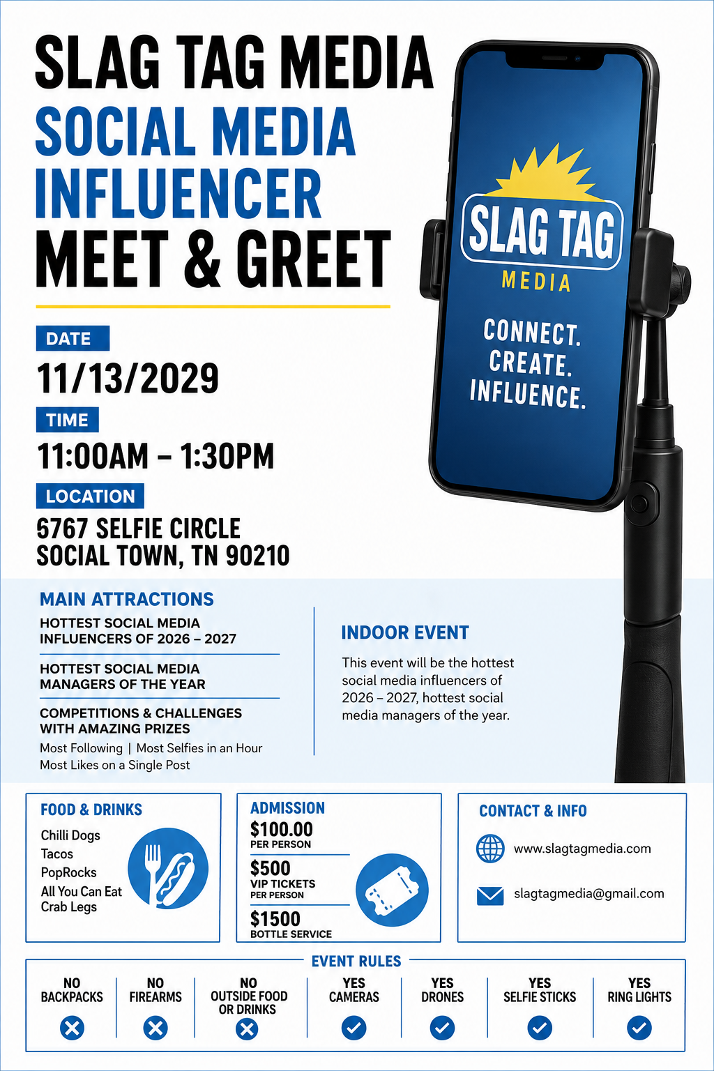
ChatGPT
This is probably my favorite of the designs layout being the first design request. It still needs work but being the first request, this could be post ready now or make a few changes.
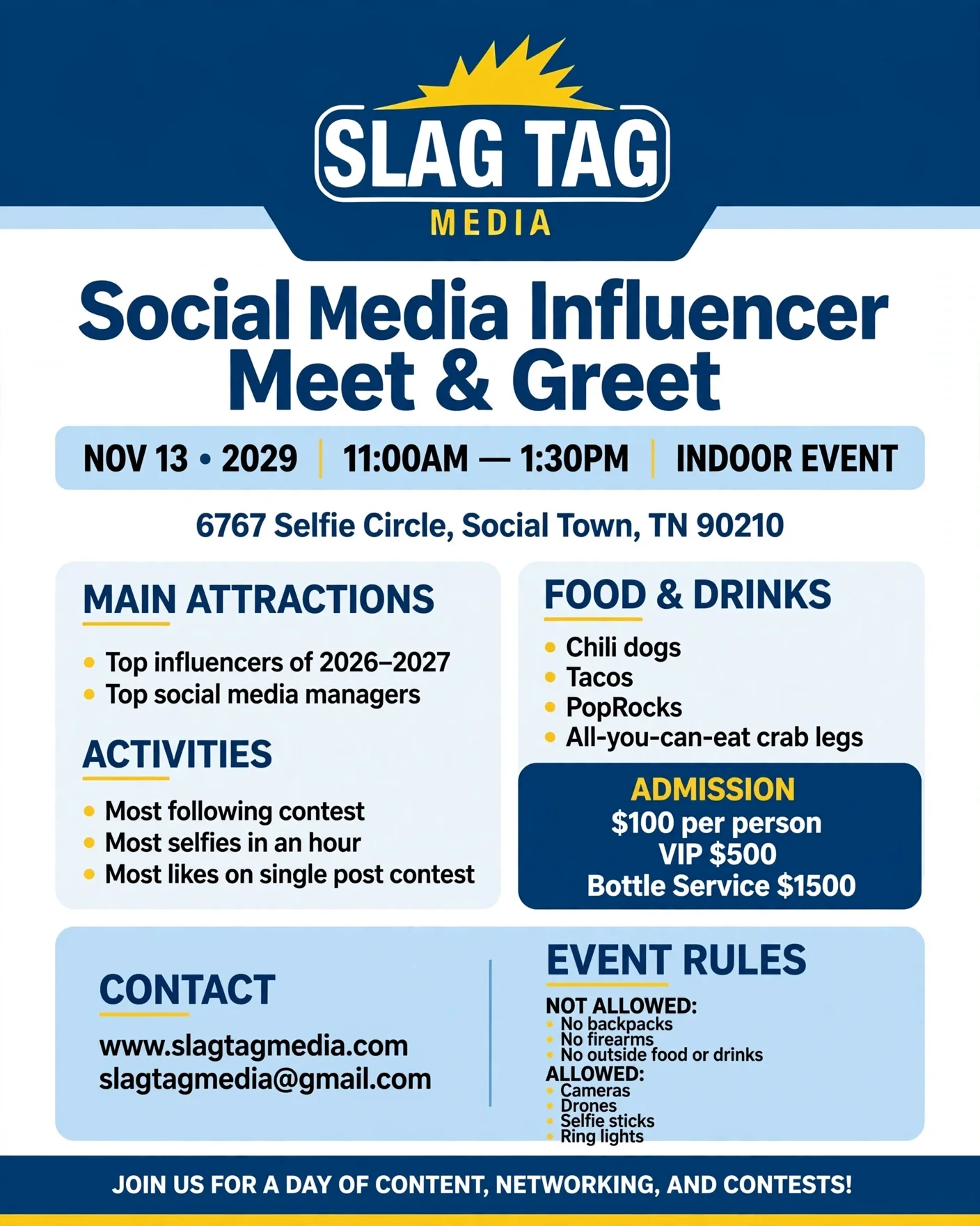
Meta AI
This is a great simple flyer. Not fantastic but not bad, I’d say right in the middle.
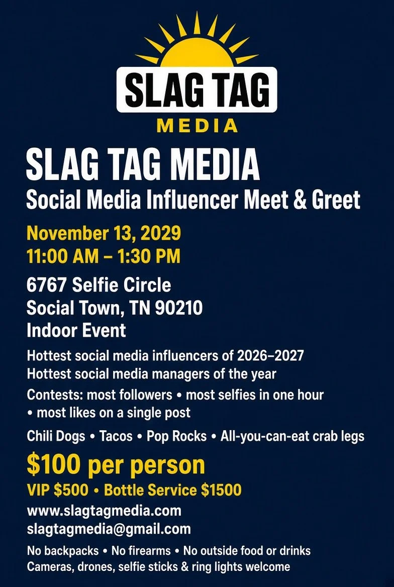
Grok
This is probably the simplest design out of them all. It’s just like it requested, simple and no void fill. I dont like this very much especially because it didn’t use the SlagTag Media logo but if you want a simple flyers made by AI, this could be for you.
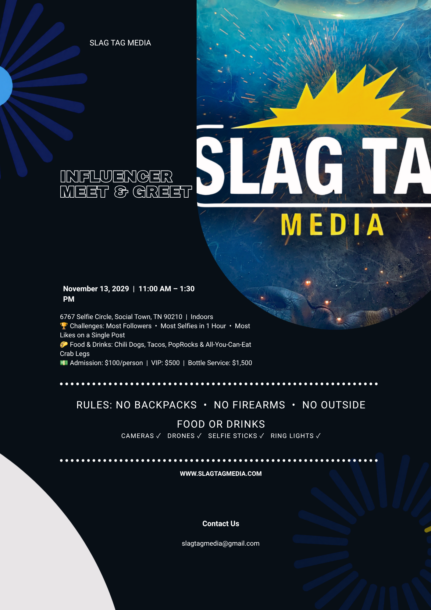
Canva AI
Being the first image it would need some changes, the first would be the Slag Tag Media logo would nee to be resized. The cool think about designing an ai image in Canva is its already depurated in layers, so its easy to make changes on your own, or ask ai to make the changes for you. This is my favorite option of them all. Have an image foundation created for you then go in and tweak it to make it your own.
More details to come as I find more ai platforms to try out and also I'll be adding some more details as I learn more as well. So keep checking back.
Thanks for reading.